

Brand
Corti Brand Kit
Key guidelines and assets for using Corti branding in external materials. Please follow them to ensure consistency.
Logo
The logo should be used in all references to our brand whenever possible.



Orb
The orb can be used when space is tight or for logo-only designs e.g., social media avatars.




The visual shorthand for our brand is our orb. It represents the connection between technology and human care in healthcare. It’s inspired by the cochlear (part of the inner ear involved in hearing). Use this if you've already introduced Corti with the logo.
Clearance
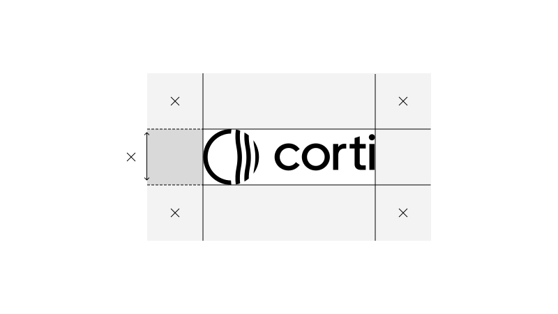
To ensure visual impact, our logo needs to be surrounded by ample and unobstructed space. All material must adhere to a minimum clearance area, which is determined by the logo's size and is equal to its height.
Colours
The colours used across the site. Click a swatch or use the button to copy its hex value.
Corti accent
- Hex
- #B8F818
- RGB
- 184, 248, 24
Black
- Hex
- #000000
- RGB
- 0, 0, 0
Darkest
- Hex
- #191919
- RGB
- 25, 25, 25
Grey
- Hex
- #666666
- RGB
- 102, 102, 102
Light grey
- Hex
- #B3B3B3
- RGB
- 179, 179, 179
White
- Hex
- #FFFFFF
- RGB
- 255, 255, 255
Typography
The typefaces used on the site, shown in regular (400) and semibold (600).
Booton
Headings and body text
Healthcare AI, built for clinicians
Healthcare AI, built for clinicians
IBM Plex Mono
Code and technical labels
POST /interactions
POST /interactions
Get the font